
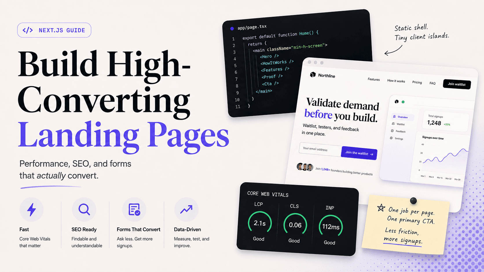
A landing page has one job: get someone to take one clear action. Sign up. Join a waitlist. Book a call. Everything else is optional.
I build product apps and marketing pages in React, Next.js, and TypeScript. When a page needs to convert — not just look polished in Figma — I treat it like a product surface: hierarchy, performance, and a form that doesn’t fight the user. This guide is how I approach a high-converting landing page in Next.js in 2026, including lessons from shipping LaunchBox, a launch toolkit built around waitlists and feedback loops.
If you’re choosing between a visual builder and custom code first, read Framer vs Next.js for SaaS landing pages. If your CTA is a waitlist, pair this with waitlist landing page best practices.
What “high-converting” actually means
Conversion rate is signups divided by visitors. A “good” number depends on traffic quality. Cold ads convert worse than warm Twitter followers. Still, structure matters more than most teams admit.
Pages that convert tend to share a few traits:
- One primary promise in the first viewport
- One primary CTA (maybe a secondary text link — not five buttons)
- Proof placed near the decision, not buried in a footer carousel
- Fast enough that people don’t bounce before they finish reading the headline
- A form that asks for the minimum needed right now
Next.js helps with the technical half: static shells, Server Components, image and font tooling, and a clean place to hang analytics without turning the whole page into a client bundle. The conversion half is still copy, layout, and restraint.
Start with the hero — and stop decorating it
The first viewport should read as one composition. Brand or product name, one headline, one short supporting line, one CTA group, and one dominant visual if you need it. That’s the budget.
What I cut from heroes more often than I keep:
- Stat strips (“10k users · 99.9% uptime · SOC2”)
- Floating badges and sticker overlays
- Two equal CTAs competing for the same click
- A feature grid that starts above the fold
If removing the nav would make the page feel like it could belong to any SaaS in your category, the brand signal is too weak. Put the product name where it carries weight — not only in a tiny logo.
Headline formula that doesn’t sound like a template
Lead with the outcome, then the who. Features come later.
Weak: “AI-powered launch platform for modern teams.”
Stronger: “Validate demand before you build — waitlist, testers, and feedback in one place.”
The second one tells a founder what they’ll get. The first one sounds like every other homepage on Product Hunt.
Visuals that earn their place
Decorative gradients are not a visual idea. Show the product: a real UI shot, a short loop of the core flow, or a clear mock of the thing people are joining. Compress it. Use next/image with explicit dimensions (or fill inside a sized parent) so you don’t torch CLS. Mark the LCP image for preload so the browser fetches it early — one priority image per page, not every card in the grid.
Give each section one job
After the hero, resist the urge to dump every talking point into one scroll. One section, one purpose, one headline, usually one short supporting sentence.
A structure I reuse for SaaS landings:
- Hero — promise + CTA
- Problem — the pain in plain language (optional if the hero already nails it)
- How it works — three steps max
- Proof — logos, quotes, numbers you can stand behind
- Features — only the ones that support the CTA
- FAQ — objections that stop the click
- Final CTA — same action as the hero, restated
If a section doesn’t move someone closer to the CTA, delete it. Long pages aren’t automatically persuasive; they’re often just hard to scan.
Next.js architecture that keeps the page fast
For marketing pages, my default is: static shell, tiny client islands.
Server Components by default
In the App Router, components are Server Components unless you opt into the client. That’s the right default for a landing page. Hero copy, feature lists, FAQ text, and footers don’t need React state. They should ship as HTML with almost no JavaScript.
Keep the page file as composition:
// app/(marketing)/page.tsx
export default function LandingPage() {
  return (
    <main>
      <Hero />
      <HowItWorks />
      <Proof />
      <Features />
      <Faq />
      <FinalCta />
    </main>
  );
}
Each section can live in its own file. Reorder without rewriting the world.
Client islands only where you need them
Reach for "use client" when you actually need browser APIs or local state:
- Pricing monthly/annual toggle
- Mobile nav
- Waitlist form with client-side validation feedback
- Scroll-linked motion that CSS can’t express cleanly
Push that boundary as deep as you can. Don’t wrap the entire page in a client component because the form needs useState.
Motion without killing INP
I use Framer Motion on product UI when springs and layout animations earn their keep. On a landing page, entrance fades and hover states are usually cheaper as CSS. Every kilobyte of animation library competes with your form’s responsiveness (INP). If you keep Motion, lazy-load it and limit what’s animated above the fold.
Forms: the conversion engine
A beautiful hero with a clumsy form is a leaky bucket.
Ask for less up front
Email alone beats email + name + company + role + phone on a cold waitlist. If you need qualification, collect it after signup — thank-you page or first email. People who just opted in will answer one or two questions; people who haven’t won’t.
Button copy is product copy
“Submit” describes the form. “Join the waitlist” or “Get early access” describes the outcome. Test button text before you rebuild the whole hero.
Wire it cleanly in Next.js
Patterns that stay maintainable:
- Server Action or route handler for the submit
- Honeypot or basic rate limiting for spam
- Persist UTMs from the landing URL with the signup
- Success state that confirms what happens next (“Check your inbox — we’ll send launch updates”)
For LaunchBox, the whole point of the landing wasn’t decoration — it was the start of a validation loop: capture intent, segment waitlist, recruit testers, gather feedback. The page and the product behind it should agree on that story. If you’re building that kind of funnel, the LaunchBox case study walks through the product shape.
Core Web Vitals on a landing page
Google’s thresholds still matter for SEO and for whether the page feels trustworthy. Focus on three:
| Metric | Rough target | Landing-page traps |
|---|---|---|
| LCP | under ~2.5s | Huge uncompressed hero, late-discovered LCP image, blocking fonts |
| CLS | under ~0.1 | Images without size, font swap jumps, Suspense fallbacks that resize |
| INP | under ~200ms | Heavy client bundles, main-thread work on every click |
Practical checklist I run before calling a page done:
- One LCP candidate identified; image uses
next/imagewith sensiblesizes - Fonts via
next/font(no flashy layout shift on swap) - No full-page
"use client"wrapper - Analytics and chat widgets deferred until after interaction or idle
- Suspense fallbacks match final content height if you stream anything
- Mobile pass: CTA visible without hunting; tap targets aren’t tiny
Field data in Search Console or CrUX beats a single Lighthouse screenshot on your laptop. Fix what real users hit.
SEO basics that still pay off
Landing pages need to be findable and understandable:
- Unique title and meta description (excerpt in CMS often doubles as description)
- One clear H1 that matches the promise
- Canonical URL set
- Open Graph image that looks good when shared
- Appropriate schema for the page type — don’t spam FAQ schema hoping for rich results Google already retired for most sites
In the App Router, set metadata in generateMetadata (or a static metadata export) so titles aren’t an afterthought bolted on in a <Head> you forgot to update.
Internal links help both humans and crawlers. From a pillar guide like this, point to related posts and to a real project. From case studies, link back when the topic comes up.
Accessibility is conversion work
People don’t convert on interfaces they can’t use.
- Labels on inputs (placeholders are not labels)
- Visible focus states on buttons and fields
- Color contrast that survives a sunny sidewalk
- Don’t rely on color alone for error messages
- Honor
prefers-reduced-motionif you ship scroll or entrance animations
I treat reduced motion as a first-class path, not a nice-to-have. It’s also a reminder that motion should support hierarchy, not be the product.
Analytics without weighing down the page
You need to know whether the page works. You don’t need three tag managers racing the main thread.
What I usually track on a landing page:
- CTA clicks (hero and final)
- Form start (focus on email) vs form submit
- Thank-you page views (the real conversion event)
- Optional: scroll depth if you’re debating whether a section earns its keep
Load analytics after the page is usable when you can. A perfect attribution setup that adds 300ms to every interaction is a bad trade. Same for chat widgets that open themselves on mobile — they steal taps from your form.
UTMs belong with the signup record. Future you will want to know which thread or campaign brought someone who later became a customer or a beta tester.
A/B testing without theater
Change one meaningful thing at a time: headline, primary button label, number of form fields, or hero visual. If you change five things and conversion moves, you learned nothing useful.
You don’t need a heavyweight experimentation platform on day one. For early traffic, ship variant A for a week, variant B for a week, and compare thank-you rates with the same traffic mix. Once volume justifies it, graduate to a proper test. Until then, bias toward shipping the clearer headline.
Worked sketch: a SaaS waitlist page
Here’s a concrete shape I might ship for a pre-launch tool (names invented, structure real):
Route: / or /waitlist under a lean marketing layout — no dashboard providers.
Hero: Product name “Northline” · Headline “Know who wants your product before you build the backlog” · Subhead for indie SaaS founders · Email + “Join the waitlist” · Trust line “Launch notes only. Unsubscribe anytime.”
Below: Product UI still · three steps (publish page → capture waitlist → invite testers) · one short founder quote · FAQ with four objections · final CTA repeating the same form action.
Tech: Server Component sections; client WaitlistForm; Server Action writes to Postgres with UTMs; /thanks shows a single qualifying question (“What are you launching?”) and optional share link.
That’s basically the front door of something like LaunchBox — marketing page as the start of a validation loop, not a brochure that dies on submit.
Copy and design habits that improve conversion
A few patterns I keep returning to:
Specificity beats adjectives. “Cut your launch toolkit from five tabs to one” lands harder than “streamline your workflow.”
Social proof near the decision. A logo row halfway down the page is fine. A concrete line under the form (“Join 400 founders already on the list”) often moves the needle more.
Mobile is not a shrink-wrap of desktop. On small screens, the first viewport is headline + subhead + form. If the product shot pushes the CTA below the fold, reorder.
Match message to traffic. Ad traffic that promised “free waitlist tool” should not land on a vague brand manifesto. Continuity from click to headline reduces bounce before your clever animation ever plays.
Quiet UI, loud offer. Heavy glow effects and stacked shadows don’t make the offer clearer. Contrast, type size, and whitespace do.
Routing and layout tips in the App Router
A few structural choices that save pain later:
- Put marketing pages in their own route group with a light layout (no authenticated shell, no dense app nav).
- Keep the primary CTA id stable (
#signupor#waitlist) so ads and emails can deep-link. - Prefer a dedicated thank-you route over client-only success states that vanish on refresh.
- If the blog and marketing site share a design system, share tokens and button styles — not the entire app
Providerstree.
Separation of layouts is boring architecture that pays for itself the first time someone pastes a Chart.js provider into the homepage “just for a social proof chart.”
A realistic build sequence
When I start a conversion page in Next.js, the order looks like this:
- Write the headline, subhead, and CTA offline — no components yet
- Sketch section order on paper (or a boring outline doc)
- Scaffold the App Router page with Server Component sections
- Add the form island and wire persistence
- Drop in the real product visual and optimize LCP
- Add proof and FAQ only after the core story works
- Measure Lighthouse + a quick mobile session on a mid-range phone
- Ship, then change one thing at a time (headline, button, form fields)
Teams get stuck polishing gradients in week one while the form still posts to nowhere. Reverse that.
Common mistakes I see (and have made)
Treating the landing page like the app shell. Shared authenticated layouts, heavy providers, and dashboard fonts bleed into marketing routes. Keep marketing routes lean.
Animating everything. Motion that supports hierarchy is useful. Motion that delays the first paint is expensive theater.
Five CTAs. “Start free,” “Book demo,” “Watch video,” “Read docs,” and “Star on GitHub” in the same hero is decision paralysis dressed as optionality.
Proof you can’t defend. Fake counters and vague “trusted by industry leaders” copy erode trust when someone looks closer. Empty proof is worse than no proof.
Ignoring the thank-you state. The moment after signup is when referral prompts and one qualifying question work best. Ending on a blank “Success” toast wastes intent.
Shipping the template unchanged. Visitors can smell a theme. Swap stock sections for your real product story or you’re paying for uniqueness you didn’t use.
Optimizing Lighthouse while the form 500s. Performance scores don’t matter if the CTA is broken. Fix the path to thank-you first.
Pre-launch checklist
Use this the day before you point ads or a launch tweet at the URL:
- Headline + CTA make sense to someone who has never heard of you
- Form submits successfully on mobile Safari and Chrome
- Thank-you page (or stable success state) works on refresh
- Welcome email or confirmation path is live
- LCP image and fonts aren’t surprising you in PageSpeed
- No accidental
noindexon the production marketing route - Analytics fires on thank-you, not only on landing
- Legal links (privacy) exist without cluttering the hero
Putting it together
A high-converting landing page in Next.js is less about framework trivia and more about discipline: one job per page, one job per section, a fast static shell, and a form that respects the visitor’s time. Use Server Components for the story. Use client components for the few interactions that earn their JavaScript. Measure what real users experience.
If you’re validating a product before you overbuild it, start with a tight waitlist page and an honest promise — waitlist landing page best practices goes deeper on that funnel. If you’re still deciding whether to stay in a visual builder, Framer vs Next.js lays out the tradeoffs I weigh with clients and on my own products.
Want help shipping a conversion-focused page or reviewing one you’ve already got? Get in touch.